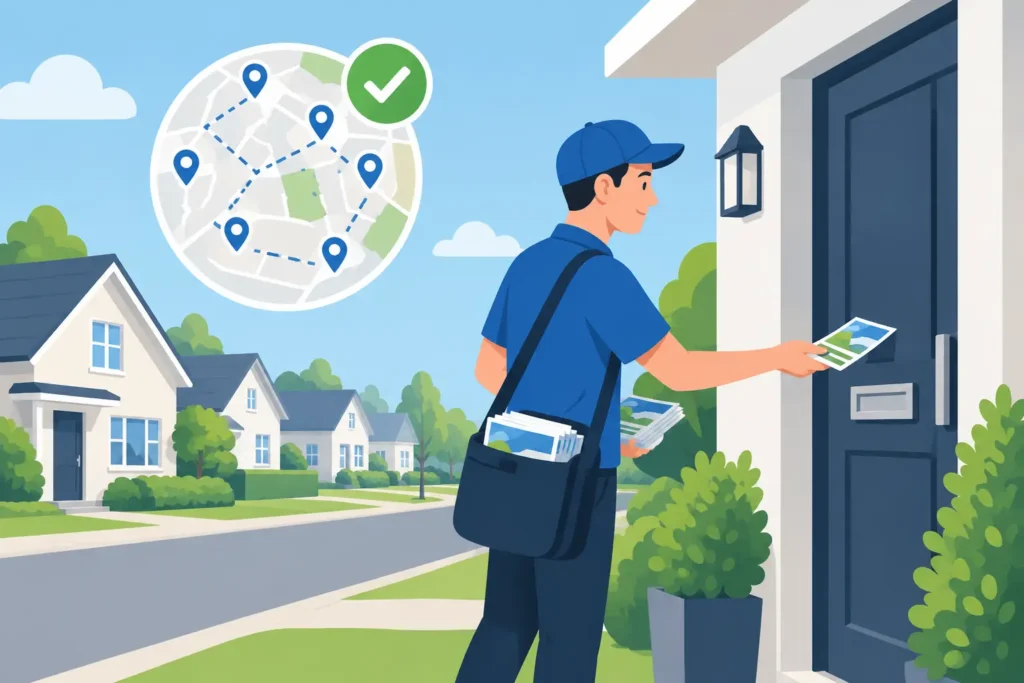
A takeaway menu pushed through the right doors on a Thursday can fill tables by the weekend. The same offer printed as a thick, folded brochure and handed out outside a station may be ignored completely. Format is not a minor production choice. It affects what people notice, what they keep, how much information they absorb and whether your distribution team can place it where it will work.
This guide to print advertising formats is built for London businesses that need local reach, clear offers and a campaign that can be properly controlled from print to delivery. Start with the action you want, then choose the format that gives that action the best chance of happening.
Start with the job your print needs to do
Before choosing a paper size, decide what the item must achieve. A new gym opening in Enfield may need a simple, high-impact offer that residents can understand at a glance. A property agent promoting several instructions may need more room for images, service detail and contact information. A restaurant with changing specials needs something people will keep near the kitchen rather than discard at the door.
The strongest format is usually the one that makes the next step easiest. That might be scanning a QR code, booking an appointment, claiming an offer, visiting a shop or calling a local number. If the reader has to hunt for the point, the format is working against the campaign.
Also consider the distribution method early. Door-to-door campaigns are well suited to items people can pick up and read at home. Hand-to-hand distribution works best when the message is immediate and the format can be taken in within seconds. A good print choice and a good delivery plan should be made together, not in separate conversations.
Guide to print advertising formats for local campaigns
Flyers: one message, fast response
A flyer is the workhorse of local advertising. It is generally a single sheet, often printed on both sides, designed around one clear offer or message. A5 is a popular choice because it is large enough for strong imagery and essential detail, while still being easy to carry, post through letterboxes and distribute in volume.
Use flyers for launches, time-sensitive promotions, seasonal services, event announcements and local awareness campaigns. A cleaner might lead with an introductory offer and a direct booking route. A café might promote a new brunch menu with opening times and a map. Keep the hierarchy firm: headline first, offer second, response route third.
A flyer becomes less effective when it tries to explain every service you provide. If the campaign needs detailed comparisons, multiple locations or several product ranges, move to a format with more panels or pages.
Leaflets: more room without losing simplicity
The terms leaflet and flyer are often used interchangeably, but a leaflet commonly gives you more structured space. It can be a larger flat sheet or a folded piece that breaks information into clear sections. This makes it useful for businesses that need to introduce an offer while providing enough reassurance for a considered decision.
A folded leaflet can separate the reader journey naturally. The cover earns attention. Inside panels explain benefits, show proof or outline services. The final panel gives a clear call to action, contact details and a response device such as a unique code.
For local trades, healthcare providers, education services and community organisations, this extra room can build confidence. The trade-off is that folding reduces immediate visibility. Your cover must therefore do more work than it would on a simple flat flyer.
Brochures: detail for higher-consideration decisions
Brochures are designed for campaigns where people need more information before they act. They may be folded or multi-page, and are particularly useful when photographs, credentials, case studies, menus, packages or service explanations influence the decision.
A brochure suits estate agents, care providers, wedding venues, training providers, home improvement firms and businesses with a broader range of services. It gives the reader something they can return to after the first interaction. That matters when the buying decision is not immediate.
Do not use a brochure simply because it feels more substantial. If the message is a limited-time opening offer, a brochure can slow down the response. Give it a specific role: explain, reassure and keep your brand in consideration after the first contact.
Folded formats: organise the message
Bi-fold and tri-fold leaflets are practical when your message has a natural sequence. A bi-fold creates four panels and works well for a concise service introduction or event programme. A tri-fold creates six panels and can accommodate a more detailed story, such as services, testimonials, locations and contact details.
The fold should guide the content, not interrupt it. Avoid placing a face, phone number or key sentence directly on a fold line. Plan the panel order before design begins, especially where the leaflet will be read in a particular sequence. A confusing fold can make a well-written message feel disorganised.
Postcards and vouchers: built for a single action
Postcard-style advertising is compact, direct and hard to misunderstand. It is particularly strong for a single offer, invitation or reminder. Think of a beauty salon inviting nearby residents to a launch weekend, or a local retailer promoting a specific in-store event.
Vouchers work in a similar way, but their strength lies in tracking. A unique code, expiry date or QR code gives people a practical reason to retain the item and gives your business a clearer view of response. The offer needs to be prominent, with terms kept brief and readable.
These formats have limited space, so do not crowd them with a full company history. Lead with the benefit, show the action and make redemption straightforward.
Choose the size by reading distance and content
Size changes how a printed item is used. A6 is compact and suited to quick, simple promotions, but it leaves little room for complex layouts. A5 provides a reliable balance for most door-to-door campaigns. A4 gives you more visual impact and information space, though it needs disciplined design to avoid looking like a notice rather than an advert.
Larger is not automatically better. In a busy household, a clean A5 leaflet with a sharp offer may outperform a larger piece packed with copy. For hand-to-hand distribution around transport hubs or shopping areas, the item should be easy to accept and read while moving. For targeted household distribution, you can afford to provide a little more detail because the reader can engage with it at home.
Paper, finish and design should support the campaign
The physical feel of print communicates something before a word is read. A lighter stock can be appropriate for high-volume, offer-led flyers. A heavier stock can make a voucher, appointment card or premium service leaflet feel worth keeping. Gloss can make bold photography and food imagery stand out, while matte finishes often suit more understated, professional branding.
The choice depends on the audience and message. A luxury beauty clinic and a family takeaway should not necessarily use the same finish or design style. What they must both share is clarity. Use one primary headline, high-contrast colours, readable type and a call to action that is impossible to miss.
Do not let design become decoration. A polished leaflet that hides the offer, postcode area, booking route or deadline is not ready for distribution. Build in white space and give the most valuable information room to breathe.
Match format to distribution and measurement
A successful print campaign is not finished when the artwork goes to print. The real question is whether the right households or passers-by receive it. For door-to-door activity, target areas where your service, catchment or delivery radius makes sense. For hand-to-hand activity, match the message to the location and time of day – commuter offers, lunch promotions and event invitations all need different environments.
Every format should include a way to measure interest. This could be a campaign-specific phone number, landing-page address, QR code, voucher code or a simple instruction to mention the leaflet. Use one primary response route where possible. Too many choices can reduce action and make results harder to interpret.
Accountability matters just as much as creative. GPS-tracked distribution and supervised teams give you evidence that materials were delivered in the selected areas, rather than leaving you to hope that coverage happened. Wendigo Distribution manages the process from targeting and creative support through printing and monitored delivery, helping London businesses keep control of the full campaign.
Give the reader one clear reason to keep it
The best printed advert earns a place on the kitchen counter, in a bag or beside the front door. It may offer a useful saving, a reminder of a nearby service, an event date or a simple solution to a local need. Choose the format that carries that reason clearly, then make sure the distribution is targeted, supervised and measurable. That is how print becomes a practical route to new local customers, not just paper through a letterbox.